Pratt & Whitney MED Program
Logo Design & Visual Identity Proposal
Pratt & Whitney's Manufacturing Engineering Development (MED) Program is a two year rotational program in Manufacturing Engineering targeted at new college engineering graduates designed to expose participants to the high technology, fast-paced world of aviation manufacturing with challenging assignments in the many disciplines of Manufacturing, which include part manufacturing, assembly, and specialties such as coating, welding, forging and machining.
I was approached by a participant of the MED Program at Pratt & Whitney looking for a new logo to represent the program and its core ambitions of skill development, education, and innovation.
As such a unique department at Pratt & Whitney, both client and I agreed that the MED Program deserved a representative logo to match. The logo had to both call back to the program's heritage of Pratt & Whitney, and allude to the novel, cutting-edge work being conducted by nowhere else but the MED Program. I decided to start looking at the different logos used by the parent company of Pratt & Whitney—a soaring bald eagle, and a minimalist icon of a rotating jet turbine—and to build from there.
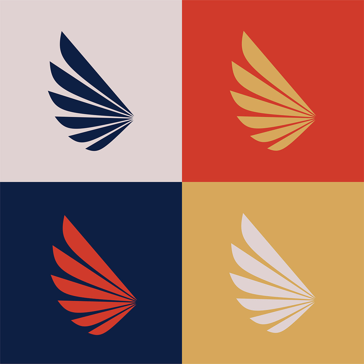
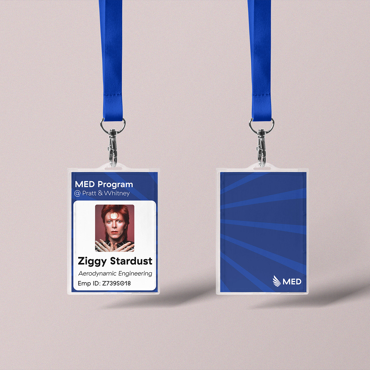
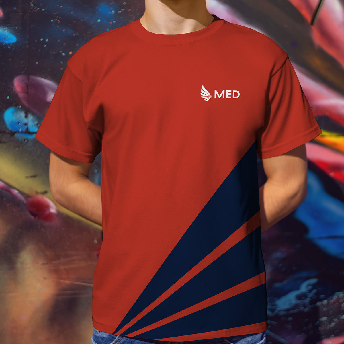
The final logo design is an amalgamation of both entities: the traditional eagle, and the modern turbine. The new logo represents both an extended wing of a soaring raptor, and the spinning blades of a jet turbine. The logo ascends upward and scales outward, evoking the progression of technology and development of skill occurring within the program. The identity design fulfilled by a distinct color palette and typography, as well as several prospective methods of application for use by program engineers and staff, including social media compositions and branded livery.

